Design a 404 page that is not boring. It should suit the brand and be useful to the people who land on it.
I asked two questions before designing: whose brand is this, and how does someone end up on this page? With no answers given, I made three assumptions.
A 404 page for Hercule that turns a visitor who clicked an expired 20% off banner into an order.
I found the user by walking backwards from the click. The link was a 20% off banner on another website, so the person who taps it is motivated by price and ready to order.
He was promised a deal and it is gone. He does not know whether the mistake is his, and a standard 404 page gives him nowhere to go. I chose to solve the broken promise, because it is the reason he leaves.
A replacement offer has to match the broken promise in kind, with no new conditions. I compared four options against that rule.
| Offer | Decision | Why |
|---|---|---|
| Buy one, get one 50% off on orders over $50 | Rejected | He is one person ordering one meal. It is a worse deal with a higher bar. |
| A free salad with an order | Rejected | He wanted to pay less, and this gives him more food. |
| Honour the 20% | Rejected | Hercule does not control the old banners, so the discount would never end. |
| 10% off, applied automatically | Chosen | It is the same kind of value, it is already a live promotion in the system, and he types no code. |
The cost of this decision: some visitors who wanted 20% will find 10% too low and leave. I accept that to protect the restaurant's margin.
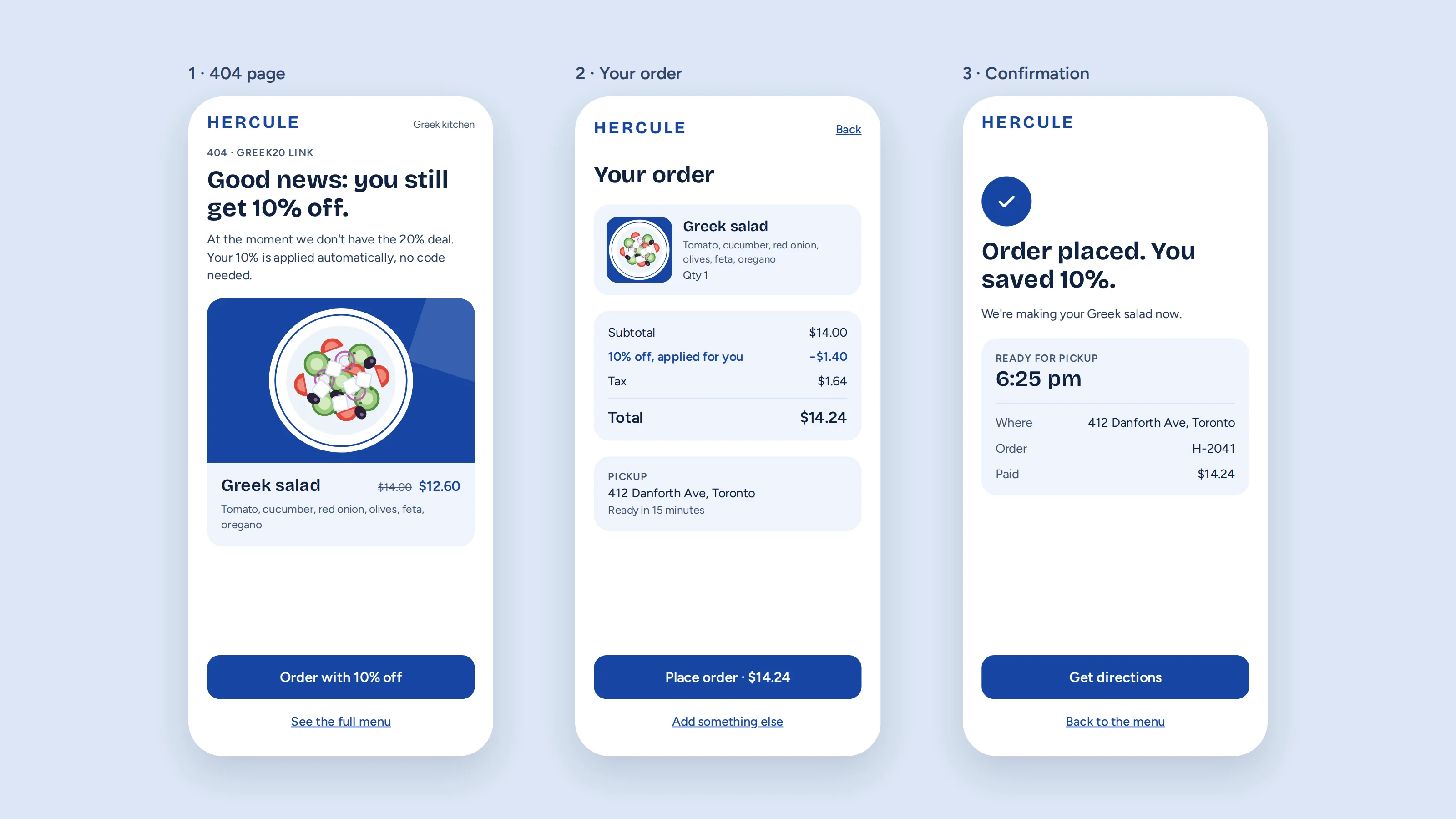
He taps the dead banner and lands on the 404 page. He orders the suggested dish with the discount already applied, reviews the order, and gets a pickup confirmation. I cut a step that asked for his location, because it adds friction for someone who is about to leave.
The share of visitors who land on this page and place an order through it.
The screens were drawn with Claude from my design decisions. The salad is an illustration, and the prices and address are sample data.