ATMs and card readers
Like taking out cash, or paying in a store.
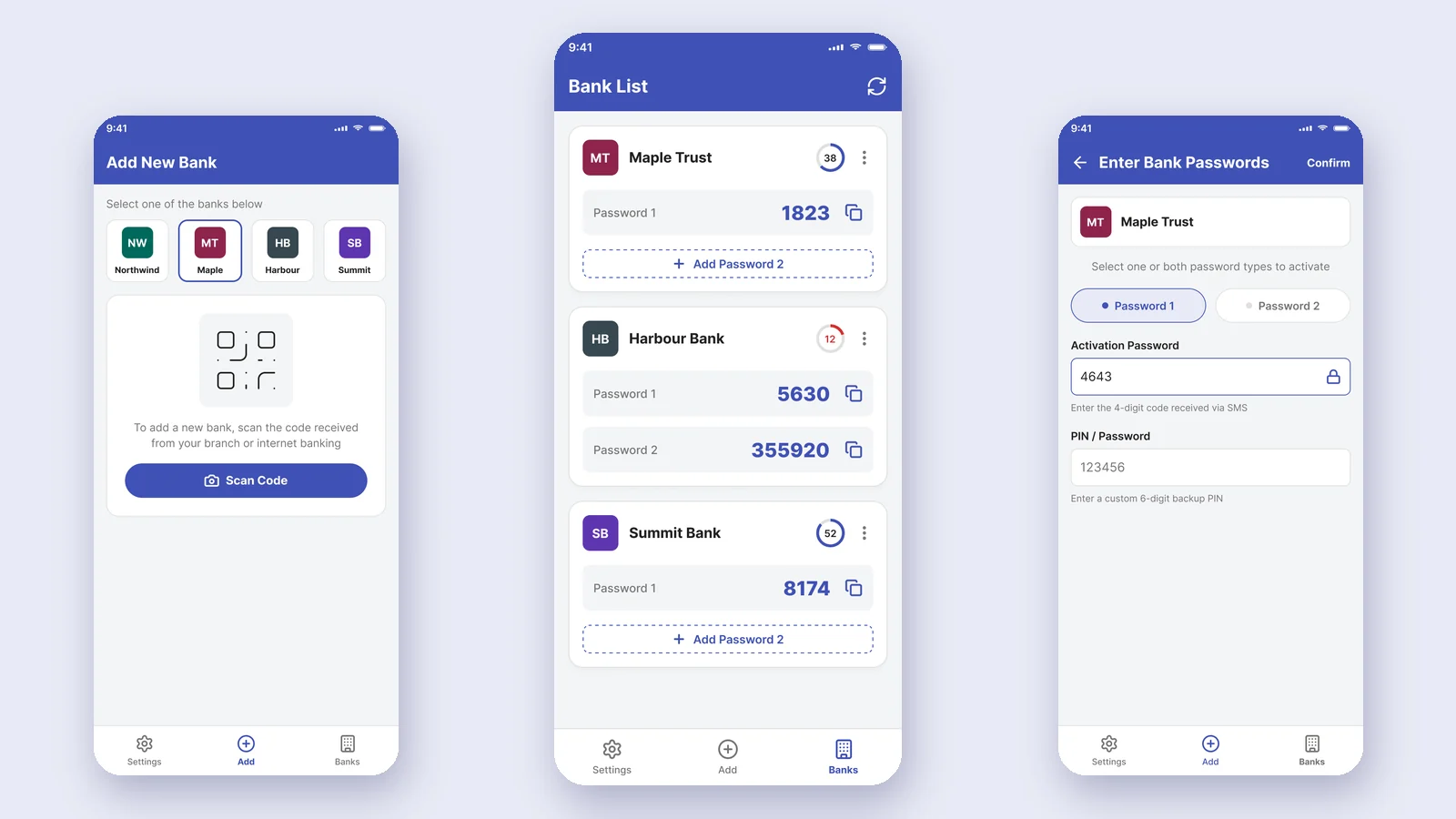
Note: I recreated these screens. The banks are fictional and the data is placeholder. The flows and decisions are real.
I started as the only designer on a team of four. The app had three screens. Then the project grew, and the team grew to 15. Every screen had its own colors, and changes got lost. So I built a design system for all our OTP apps. More than 2 million people used the app.
People needed a one-time password to approve card payments. The app made these passwords on the phone itself. It didn’t need internet. Each code worked for 60 seconds. Each bank could give two kinds of password:
Like taking out cash, or paying in a store.
For paying or moving money online.
I designed the flows and screens for iOS and Android. I followed Apple’s guidelines and Material Design. I did it all, from wireframes to final screens to annotated handoff. I also built the design system.
At the start we were four people. Me as the only designer, one iOS developer, one Android developer and one backend developer. The app had three screens. We had no design system. Everyone set their own colors on each screen.
Chapter 2The plan was to add other banks to this app. But the biggest bank wanted the app just for itself. We tried to negotiate. We only wanted to add a section for the other banks. They didn’t accept it, so we had to rethink and build a separate app for the other banks.
The team grew too. By the end we were 2 PMs, 2 designers, 4 iOS and Android developers, 3 backend developers, 2 DevOps and 2 QA. And we had a deadline.
Chapter 3More screens, more people, more apps. And the colors were still set screen by screen. So when something changed, we couldn’t track it. We had to search every page, one by one.
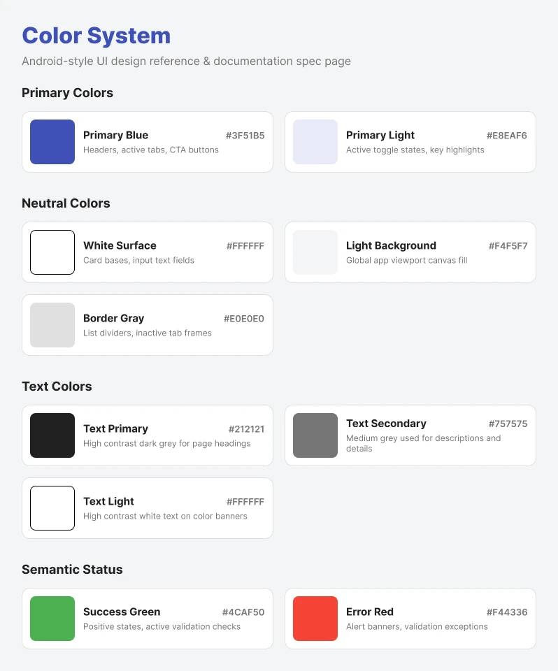
Chapter 420 components, used across all our OTP apps. One place for colors and styles, not one per screen. After that, QA found far fewer color and style issues. And handoff to developers got faster.
Three steps, from installing the app to paying.
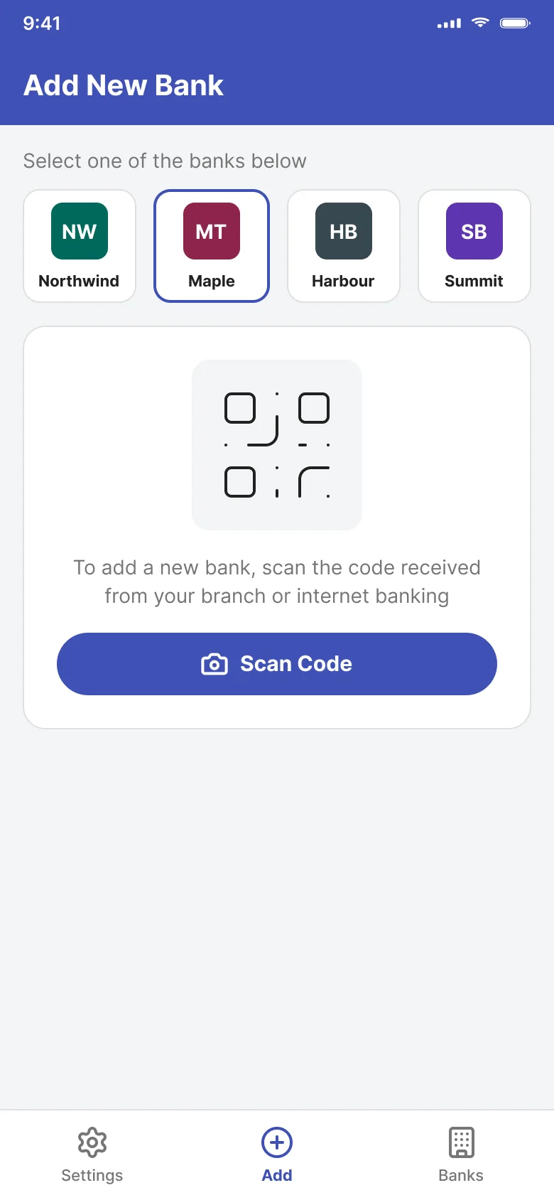
The user picks their bank. Then they scan the code they got from their branch or internet banking.
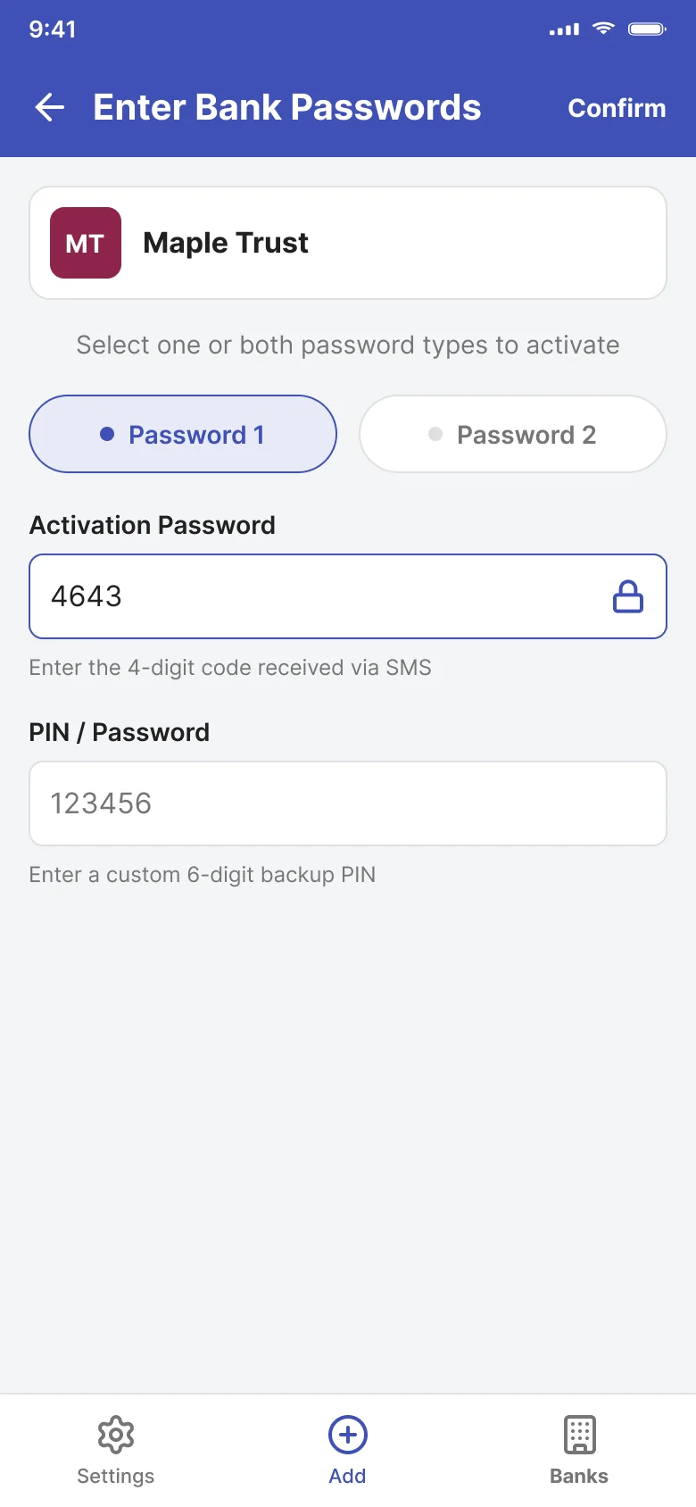
They pick Password 1, Password 2, or both. They enter the activation code from the SMS. Then they set a 6-digit backup PIN.
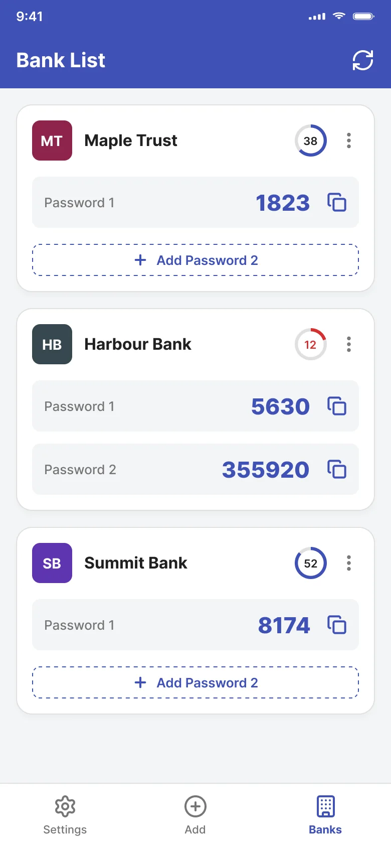
Each bank has one card. It shows the active passwords, the time left and a copy button.
The ring shows how long the code works. In the last 5 seconds it turns red. When time is up, a new code comes in. Tap copy and you see a check, so you know it worked. These codes are random, not real passwords.
Expires in 60 seconds
The activation code only came by SMS. So I asked: what if someone has internet but no signal? Or no SIM card, like on an iPad?
Options: SMS only, which was the default. Or SMS plus email. Email was my idea.
Why email: people with no signal or no SIM could still activate their passwords.
Trade-off: reach vs. security. Email reaches more people. But the banks’ security teams didn’t accept email as a safe way to verify someone. So we kept SMS only.
Each card only shows the passwords the user turned on. If Password 2 is off, you see a dashed “Add” button, not an empty field. So the screen never shows a code that doesn’t exist.
A ring shows the seconds left, as a number. In the last 5 seconds it turns red. The number is always there, so the warning doesn’t depend on color only.
People read the code at a card reader, or paste it at checkout. Usually in a hurry. So the digits are big, and the copy button is right next to the code.
The app has its own lock, a pattern or a password. Users can also set when it locks. So even if the phone is unlocked, the card passwords stay safe.
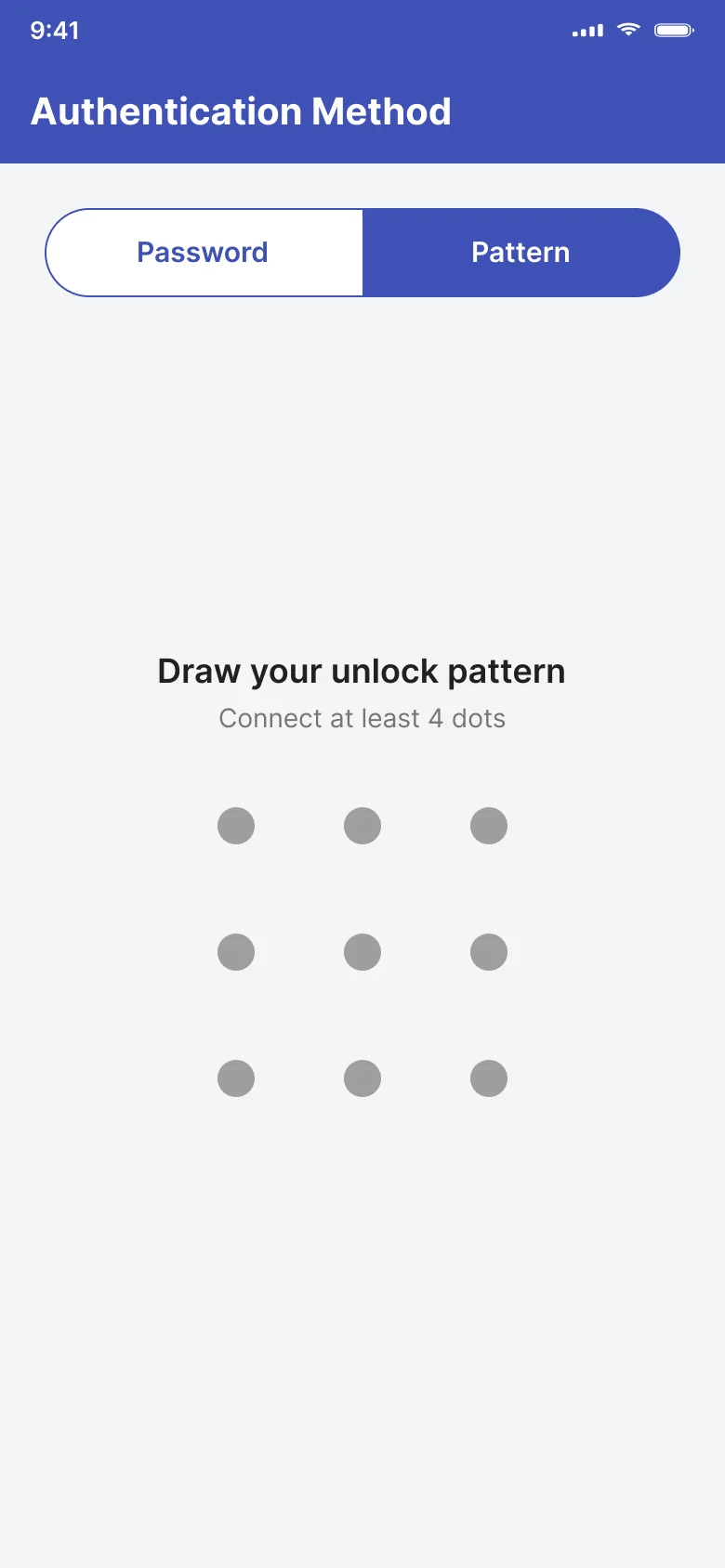
Users pick a password or a pattern to unlock the app.
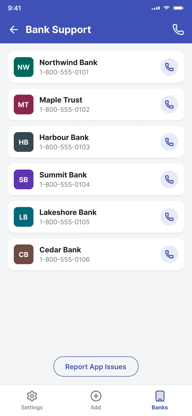
Lost a card? Password not working? Each bank’s support number is there with a call button. Users can also report a problem with the app.
2M+
people used the app
20
components in the design system
I also worked on a login redesign. It reduced fraudulent login attempts.
Looking back, I checked our colors against WCAG 2.1 AA. Most pairs pass. White on the primary blue is 6.87:1. But three pairs fail if you use them for text:
| Pair | Contrast | Fix | New contrast |
|---|---|---|---|
| Text Secondary on Light Background | 4.22:1 | #6B6B6B | 4.89:1 |
| White on Success Green | 2.78:1 | #2E7D32 | 5.13:1 |
| White on Error Red | 3.68:1 | #D32F2F | 4.98:1 |
AA needs 4.5:1 for body text. The red for the countdown warning, #D32F2F, comes from this fixed set.