Inline Card Replacement
The flagged ingredient expands in place. It has low cognitive load but falls apart if more than one item is missing at a time.
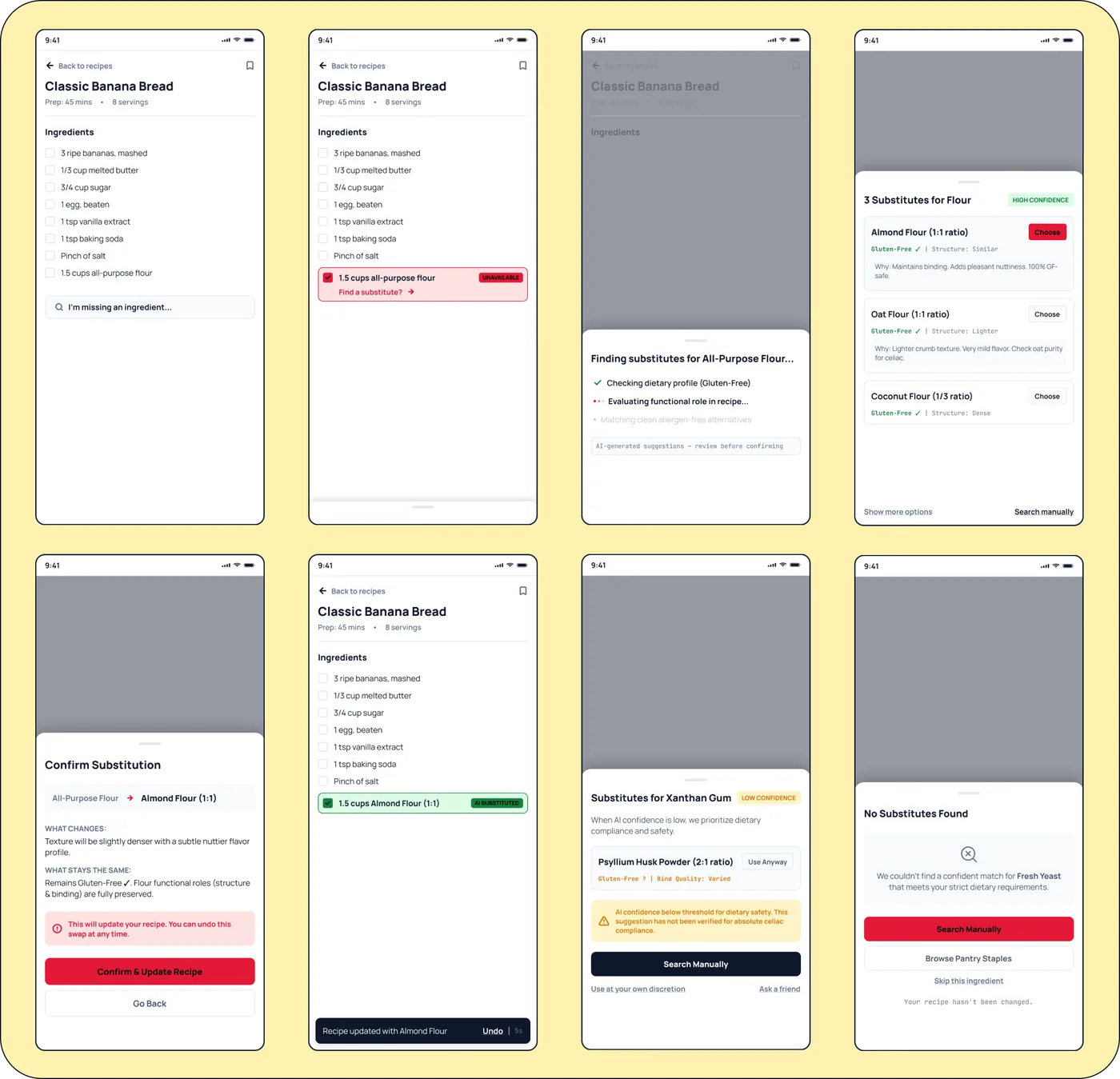
Test the 8-state substitution flow exactly as the user experiences it. You can tap the unavailable flour row to run the happy path, or use the test chips to jump straight to the low-confidence and failure outcomes.
Most of my case studies show a finished screen. This one shows the process instead. A home cook is following a recipe and an ingredient is unavailable. They need a substitute but the system cannot just swap it in silently. It has to protect the recipe's dietary requirements like gluten-free rules and functional requirements like binding.
The main constraint was to never silently modify the recipe. Every AI suggestion has to stay a suggestion until the user confirms it.
Instead of jumping straight to Figma, I prompted an AI agent to help generate three competing interaction architectures.
The flagged ingredient expands in place. It has low cognitive load but falls apart if more than one item is missing at a time.
Tapping the ingredient opens a sheet that moves through loading, options, and confirmation. The recipe stays dimmed underneath.
Great for comparing options but does not fit on a 375px mobile screen without collapsing into something else.
I picked the Bottom Sheet. It fits a mobile-first approach, helps with accessible focus management, and creates a hard separation between an AI suggestion and a permanent recipe change.
I built an 8-screen functional flow instead of one hero screen. The point was to make sure the system had an honest answer for every possible state.
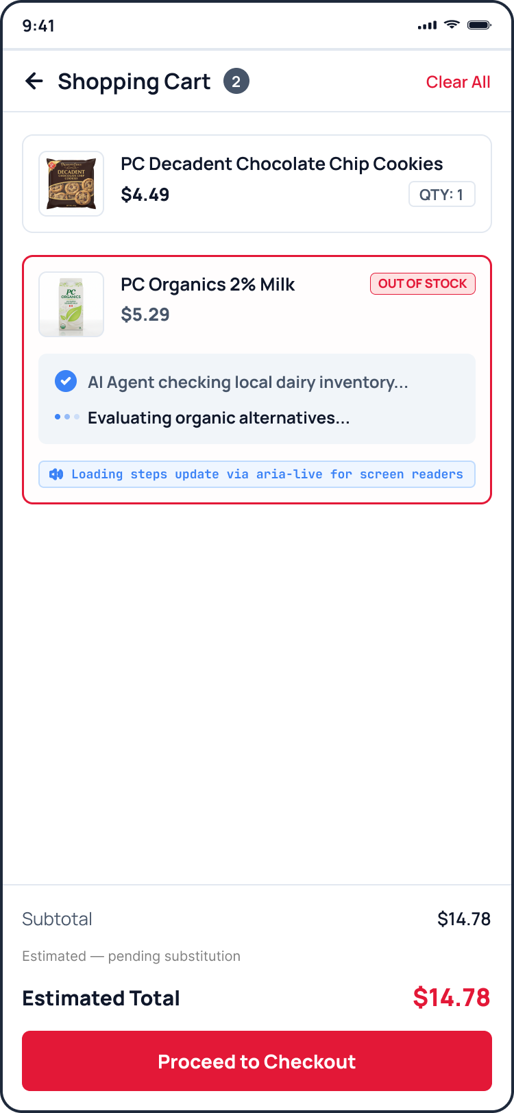
Abstracting the wait into visible, conversational steps so users don't abandon the flow.
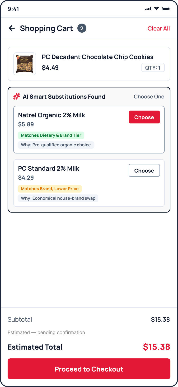
Surfacing the reasoning behind each option with a short rationale tag rather than just a name.
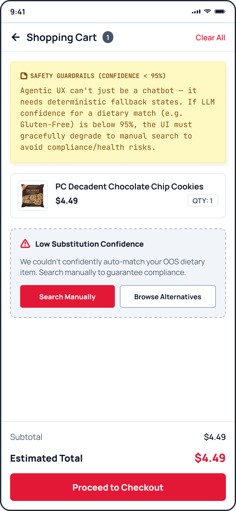
If confidence is low, the UI degrades to a manual search to avoid compliance and health risks.
Once the prototype existed, I asked the agent to critique its own work. It found five concrete risks. I treat generated prototypes as a first draft to interrogate, not a finished product.
The "Choose" button did not actually mean choose. I fixed this by renaming the button to set correct expectations without changing the architecture.
Asking users to judge AI confidence on health risks is dangerous. We have to hard-gate low-confidence suggestions for allergy tags.
This is an unfinished loop. The next step is to put this prototype in front of 3 to 5 real home cooks. I want to watch where they hesitate on the loading, option comparison, and low-confidence screens. Then I will feed those exact breaks back to the agent to fix them.