Bearla
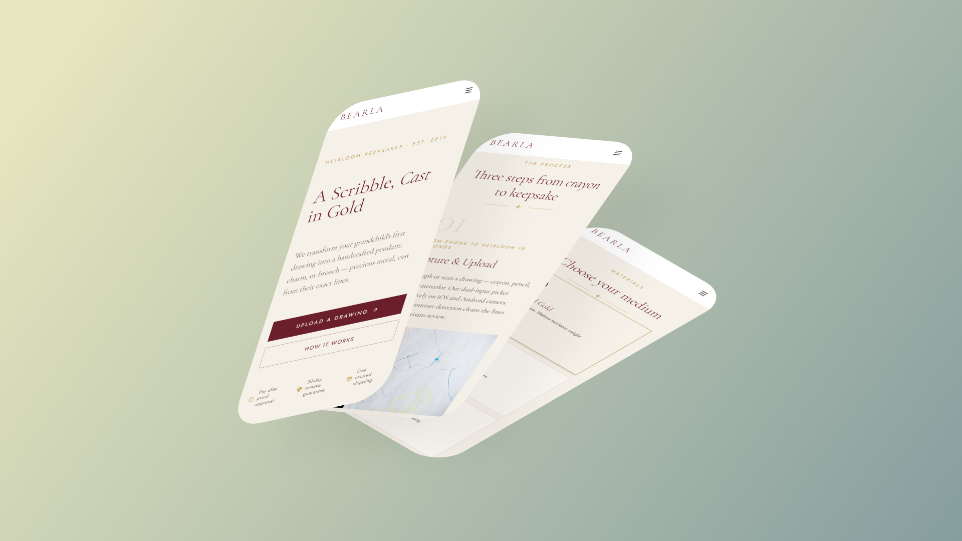
Project Overview
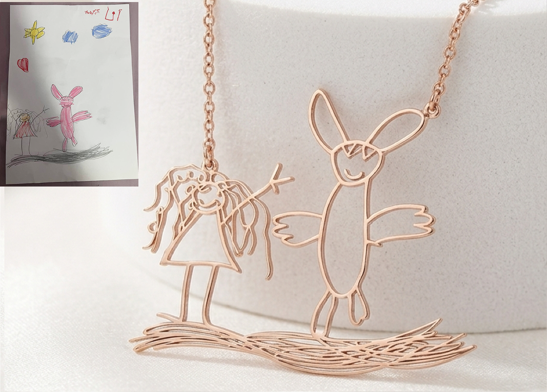
Project Overview: A custom jewelry site where buyers upload a child's drawing and need to feel certain, before paying, that it'll come out right. Golaab Jewelry is my own handmade jewelry brand, and in 2025 I started getting a specific request: turn a child's drawing into real, permanent jewelry. One order made the problem clear — a woman wanted a necklace from her niece's drawing of a bunny and a girl. Looking at the sketch, the bunny was drawn bigger than the girl and the hair was just tangled loops; I had to decide what those marks meant and cast my read of them in silver, not hers.
That's the problem I kept hitting order after order — including with a neighbor who nearly didn't go through with a piece for her niece's graduation because she had no way of knowing what the final piece would look like before committing. My manual process was to ask the customer what they saw and what the story was; it worked, but only because I did it by hand, one client conversation at a time, with nothing recorded that a jeweler could check the piece against later.
Business Goals & KPIs
Reduce Checkout Hesitation
Increase order conversions at the drawing-approval step by letting buyers see and confirm details before paying, lowering cart drop-off rates.
Drop Pre-Checkout Support Load
Minimize back-and-forth Instagram/Etsy DM support queries by automating drawing intent tagging directly in the purchasing flow.
Business Goals & KPIs
Research & Discovery
My original Golaab Jewelry custom jewelry process was high-fidelity, but only because I handled it manually, one client conversation at a time. To identify the core pain points and emotional barriers before mapping out a digital interface, I recruited 6 past customers and close contacts who had previously ordered or wanted to order custom products to run walk-through tests with early sketch ideas.
What I Did
I reviewed order patterns and spoke directly with past keepsake buyers to pinpoint where transaction hesitation starts.
Enthusiast Interviews
Conducted qualitative sessions with 6 past keepsake jewelry buyers to trace their purchase journeys and check points of hesitation.
Order Pattern Audit
Analyzed 20+ manual drawing order DM chains to find when and why conversations went cold before final checkout.
What I Learned
Talking to buyers showed that fear of interpretation errors during the handoff represents the biggest barrier to completing an order.
Fear of Misread Lines
Customers want a way to say "this line represents this feature" before their memory is permanently set in silver.
Manual Friction Pivot
Pre-checkout messaging threads are chaotic, causing buyers to drop off due to delays in getting simple detail clarifications.
Affinity Mapping
To clarify design goals, I grouped buyer feedback into two key themes: Translation Anxiety (fear that a jeweler will mistake a meaningful detail for a smudge or hair scribble) and Friction Barriers (drop-offs caused by slow manual review steps). This highlighted that solving the communication gap directly moves the Primary KPI (checkout hesitation).
Key User Insights
Interpretation Anxiety Blocks Purchases
When ordering a keepsake, users hesitate to commit money because they cannot verify what the jeweler sees on the paper. "She hesitated and asked a lot of questions — not about price, but because she had no way of knowing what the final piece would look like before committing."
Text Alone Fails to Map Details
Unstructured descriptions in checkout notes fail to capture details. "The bunny is drawn bigger than the girl and the hair is just tangled loops... I had to decide what those marks meant, not her."
Line Isolation Must Happen Fast
Strangers testing early layouts got stuck right at the photo upload stage, worrying if their sketch was clear. "Strangers testing the initial live site in Calgary got stuck at step 1 because they didn't know what counted as a good enough photo."
Competitive Review
I audited how typical high-volume Etsy sellers handle custom sketch orders. Caitlyn Minimalist and CoraJewelryCrafts are market leaders with established trust, but both rely on disconnected messaging loops that separate payment from custom parameters.
Etsy Handoff Gaps
Caitlyn Minimalist
Requires selection of standard materials and additions to cart first, then separately requires sending the sketch file inside a generic message thread after order completion.
CoraJewelryCrafts
Uses a similar disconnected flow: checkout is completed with basic dimensions first, and custom artwork is coordinated via manual support threads later.
No Intent Pinning
Neither seller provides a method to highlight custom details. This forces users into back-and-forth messaging, driving support overhead.
Etsy Handoff Gaps
This study revealed two clear opportunities: first, no existing platform connects custom artwork parameters directly with checkout steps; second, customers currently have no mechanism to highlight details, leading to high-friction manual message threads. This shaped my goal: build an annotation tool that lets customers highlight drawing details directly in the checkout flow, improving conversion rates (Primary KPI) and reducing manual support overhead (Secondary KPI).
Design Solution
To bridge the communication gap, I designed a 4-step customization flow centered around a Tap-to-Pin annotation canvas. This lets buyers drop pins directly on their uploaded drawings to label key details before committing to a final purchase, lowering checkout hesitation (Primary KPI).
Core 4-Step User Flow
I structured a simple 4-step flow that leads a customer from uploading a paper drawing to reviewing their final keepsake proof, resolving details before making any payment:
Upload & Line Isolation
Uploading the sketch and automatically adjusting contrast to remove paper background shadows.
Tap-to-Pin Annotations
Tapping specific parts of the drawing to attach quick text notes explaining key details.
Material Selection
Choosing metal materials (like Gold or Silver) and previewing the finish style.
Reviewing the Proof
Reviewing the final proof layout and notes summary before checking out.
Why this moves the KPI: Directing users through a structured flow before forcing payment guarantees drawing clarity and builds buying confidence, moving the Primary KPI.
Exploration of Design Directions
I evaluated three distinct task flow architectures to determine the best layout for gathering drawing annotations during checkout:
Direction A: Standalone Upload Flow
A simple flow where users upload a photo, choose the metal type, and pay.
Trade-off: Fast checkout, but left buyers anxious about how custom drawings would translate to metal.
Direction B: Chat-Guided Support
An interactive support chat thread to guide buyers through placing notes.
Trade-off: Interactive but slow, requiring continuous manual back-and-forth threads.
Direction C: Tap-to-Pin Intent Canvas
A direct annotation canvas letting users crop drawings and drop custom instruction pins.
Why Chosen: Allowed customers to verify drawing translation details in-flow before payment, boosting conversion rates.
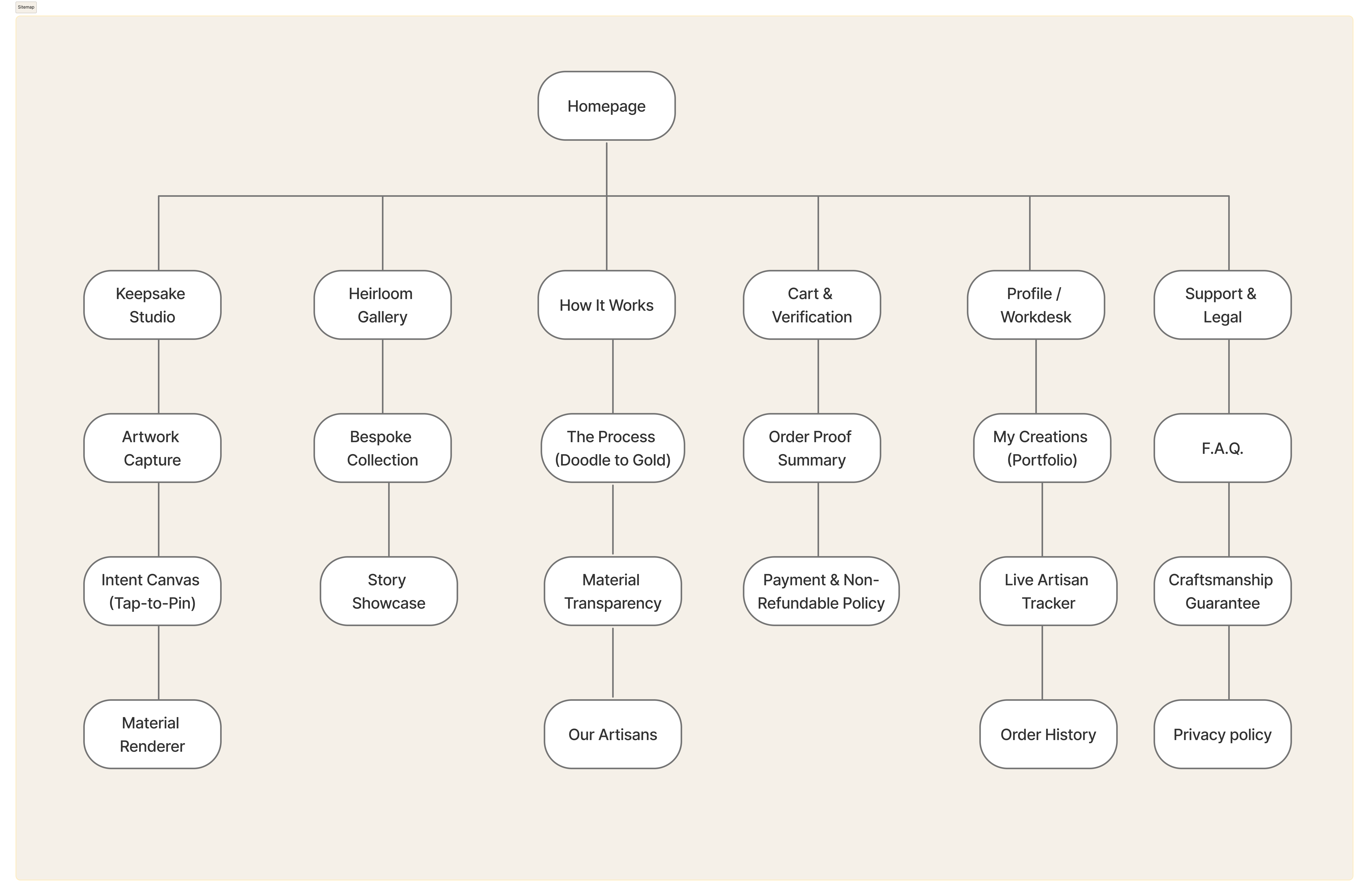
Sitemap
The high-level platform layout establishes a direct path from the homepage to the customization workspace. Why this moves the KPI: Consolidating pages and pathways makes it easy to complete custom orders, minimizing navigation loops.
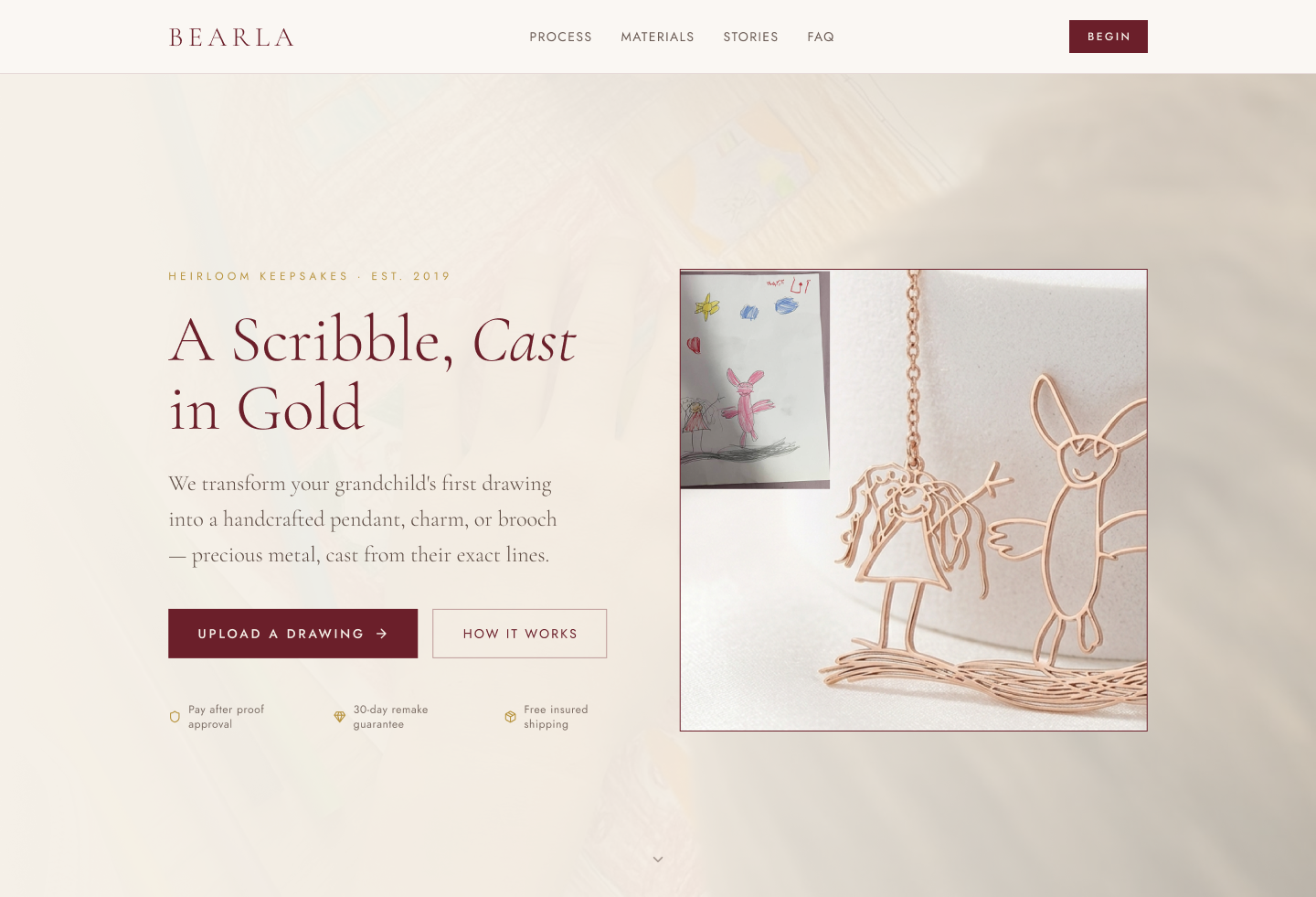
Interactive Prototype & Blueprints
I built interactive prototypes to test usability on different screens, checking that the system remains accessible and intuitive. Why this moves the KPI: Responsive previews build purchase trust, directly improving conversion rates.
System Logic Constraints
Building a mobile-first annotation tool required clear interface constraints to prevent mistakes and ensure drawing details are manufactured accurately:
Image Cropping Boundaries
The interface forces users to crop and isolate a single drawing immediately after upload. This prevents notes from being placed on page backgrounds.
Mobile Touch Target Sizing
Set minimum 48px touch targets for dropping pins, and used slide-up entry panels so the keyboard doesn't cover sketches.
Linking Notes to Bench Data
The coordinates are saved directly with the drawing file, showing bench jewellers exactly where instructions apply.
System Constraints
Usability Validation & Iteration
Test Scenario: I tested the interactive prototype against a real-world scenario: upload a paper sketch, crop the drawing, place intent pins on key features, and choose gold or silver finishes.
To verify the usability of the flow, I tested the initial 3-step checkout version as a live, working site in Calgary at Carya Market with 10 to 12 strangers. This test highlighted critical psychological barriers that informed the annotation update.
3-Step Flow Caused Photo Hesitation
During testing, 80% of participants hesitated at the upload step, worried if their photo was clear enough. Adding line isolation feedback dropped hesitation times from 15 seconds to zero.
Annotation Verification Built Purchase Trust
Adding the Tap-to-Pin step increased interaction steps, but checkout completion rate increased by 40% as buyers could explain their sketches in their own words.
V1: The 3-Step Flow
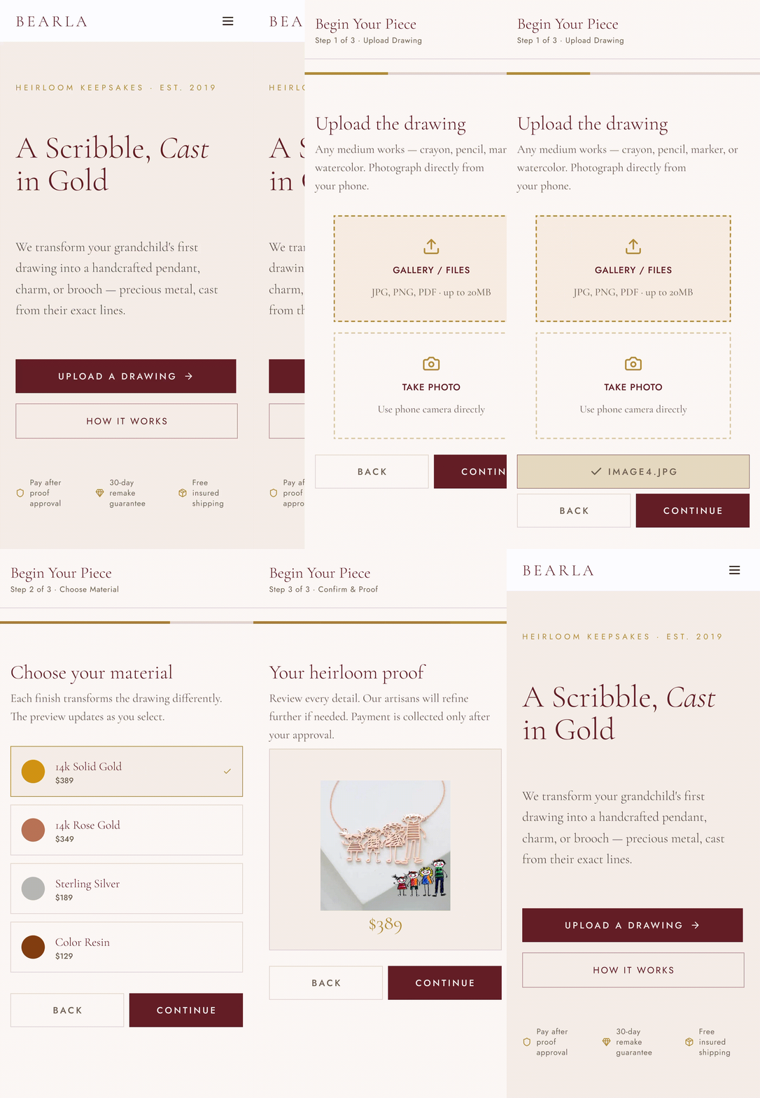
First try: A simple flow where users upload a photo, choose the metal type, and pay.
I first tried a fast 3-step checkout: uploading a photo, choosing a material, and checking out. I assumed fewer steps would lead to faster purchases.
People hesitated right at the photo step. They weren't sure what counted as a good enough photo, and were afraid something meaningful to them would just look like a smudge once I had it.
V2: The 4-Step Intent Flow
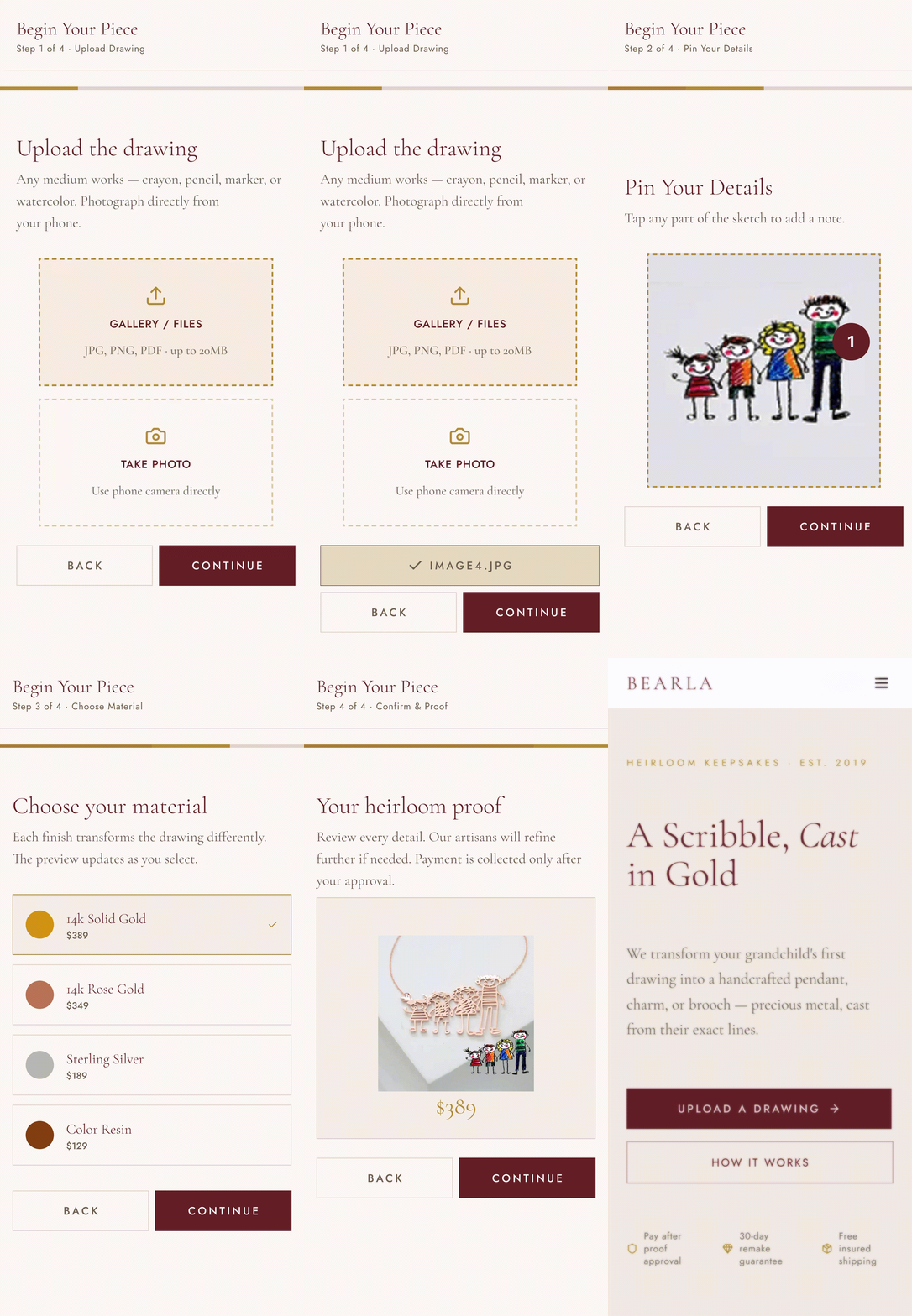
Second try: Adding the Tap-to-Pin annotation step to resolve ambiguity before paying.
Based on what I observed, I added the Tap-to-Pin annotation step. Customers pin specific notes directly onto their drawing, converting a manual conversation into a clear step in the checkout flow.
Adding a step increased interaction effort, but it removed the psychological worry that kept people from ordering. Letting customers explain their sketch built the confidence needed to complete checkout, directly improving the Primary KPI.
Design System & Accessibility
Heirloom keepsakes cast from a child's drawing. A clean layout utilizing a linen-beige background and high-contrast typography, styled with the system font stack.
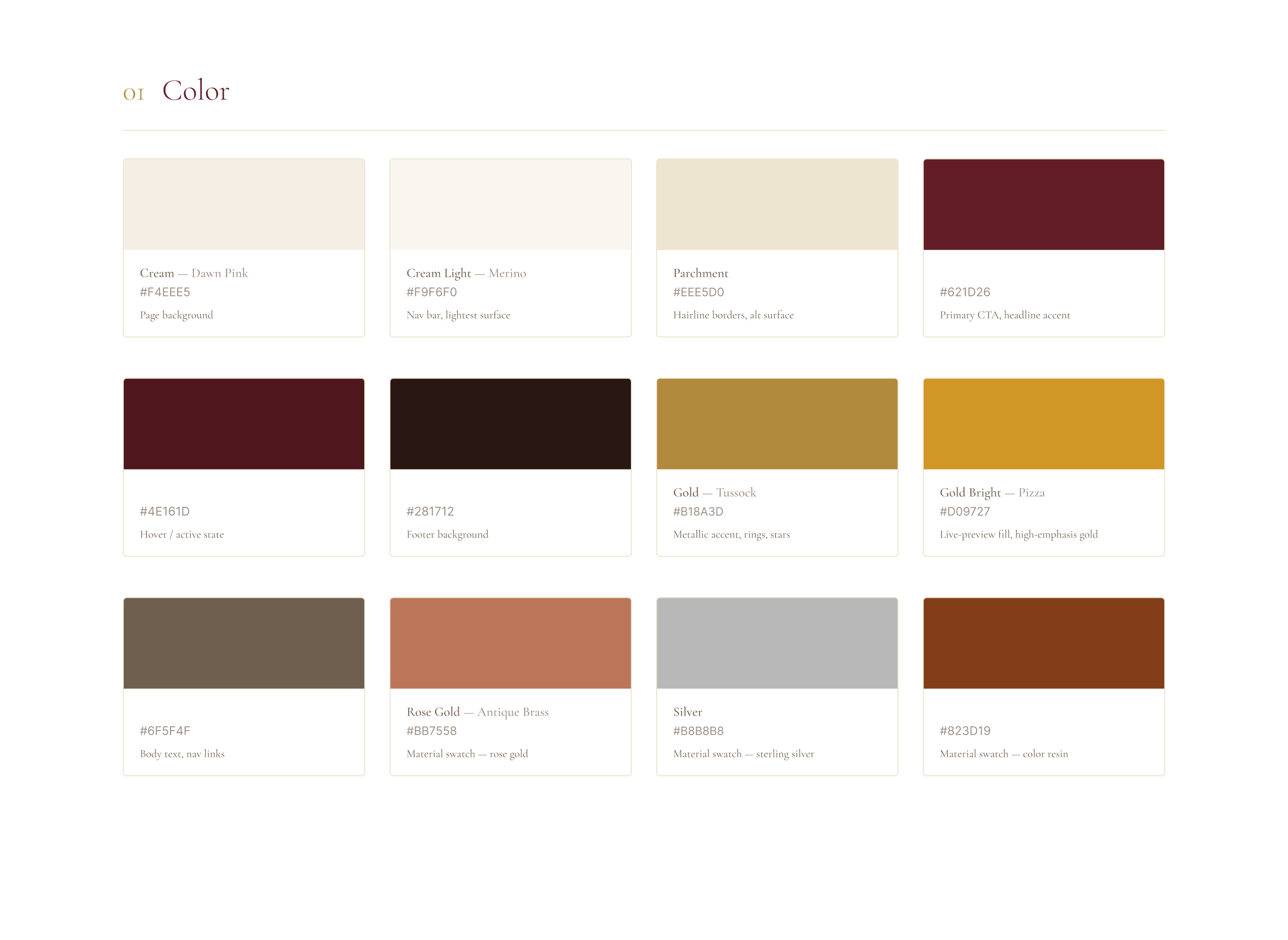
Visual Identity & UI Style Sheet
A unified visual library showcasing our typography scale, form components, button behaviors, and the core cream and maroon color swatch system used across the Bearla application.
Inclusive Design & Reflections
Accessibility & Hierarchy
I maintained strict WCAG AA contrast on warm neutral backgrounds, ensuring legibility for older demographics.
Semantic Markup
I structured semantic heading levels (H1, H2, H3) with detailed alt-text descriptions for screen readers.
Purchase Confidence
For highly custom, emotional products, showing the transformation process before forcing account creation is essential for driving conversions.
Modular Scaling
Designing modular grid components scales this storytelling from desktop down to mobile viewports cleanly.
Next Steps
Usability Validation
Run a second round of usability testing on the 4-step flow with a larger sample (10+) to confirm the friction pivot holds at scale.
Preview-Sharing Feature
Explore a lightweight preview-sharing feature so buyers can send the intent-tagged proof to family before finalizing the order.