The Museum Companion
Project Overview
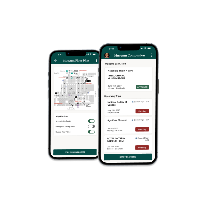
I designed the Museum Planning Companion to help teachers handle field trip logistics and lesson planning in one unified tool. By organizing chaperone ratios, student tracking, and accessibility maps into a single dashboard, it handles the messy admin tasks so teachers can focus on guiding their students.
Business Goals & KPIs
Increase Conversions
Increase the conversion rate of school group bookings by reducing drop-offs during the complex logistics phase.
Reduce Support Load
Decrease the volume of manual customer support emails/calls to museum staff by automating the chaperone ratio math and centralizing accessibility PDFs.
Business Goals & KPIs
Research & Discovery
Before designing anything, I wanted to understand what actually makes museum field trips stressful for the people running them — not just assume. I conducted 5 interviews with elementary school teachers and reviewed 10 trip-planning forums to see where the friction really shows up.
What I Did
I combined qualitative interviews with competitive reviews and quantitative surveys to map out the planning challenges from different angles.
User Interviews
Conducted 5 remote interviews (30–40 min) with elementary school educators who plan field trips at least once a year.
Competitive Review
Audited 3 existing trip-planning tools and apps currently offered by major museums.
Quantitative Survey
Surveyed 10 educators to quantify how much time is spent on manual logistics vs. curriculum lesson planning.
What I Learned
My interviews and survey results highlighted three key friction points that educators face during their preparation.
Chaperone Ratio Calculation
"70% of teachers said calculating chaperone ratios was the single most time-consuming part of trip prep."
Accessibility Fragmentation
"Teachers with students needing accessibility accommodations had no single source of truth — they were piecing together info from emails, PDFs, and phone calls."
Mobile-First Realities
"Most planning happens on a phone between classes, not at a desk — so a desktop-only tool was a non-starter."
Affinity Diagram
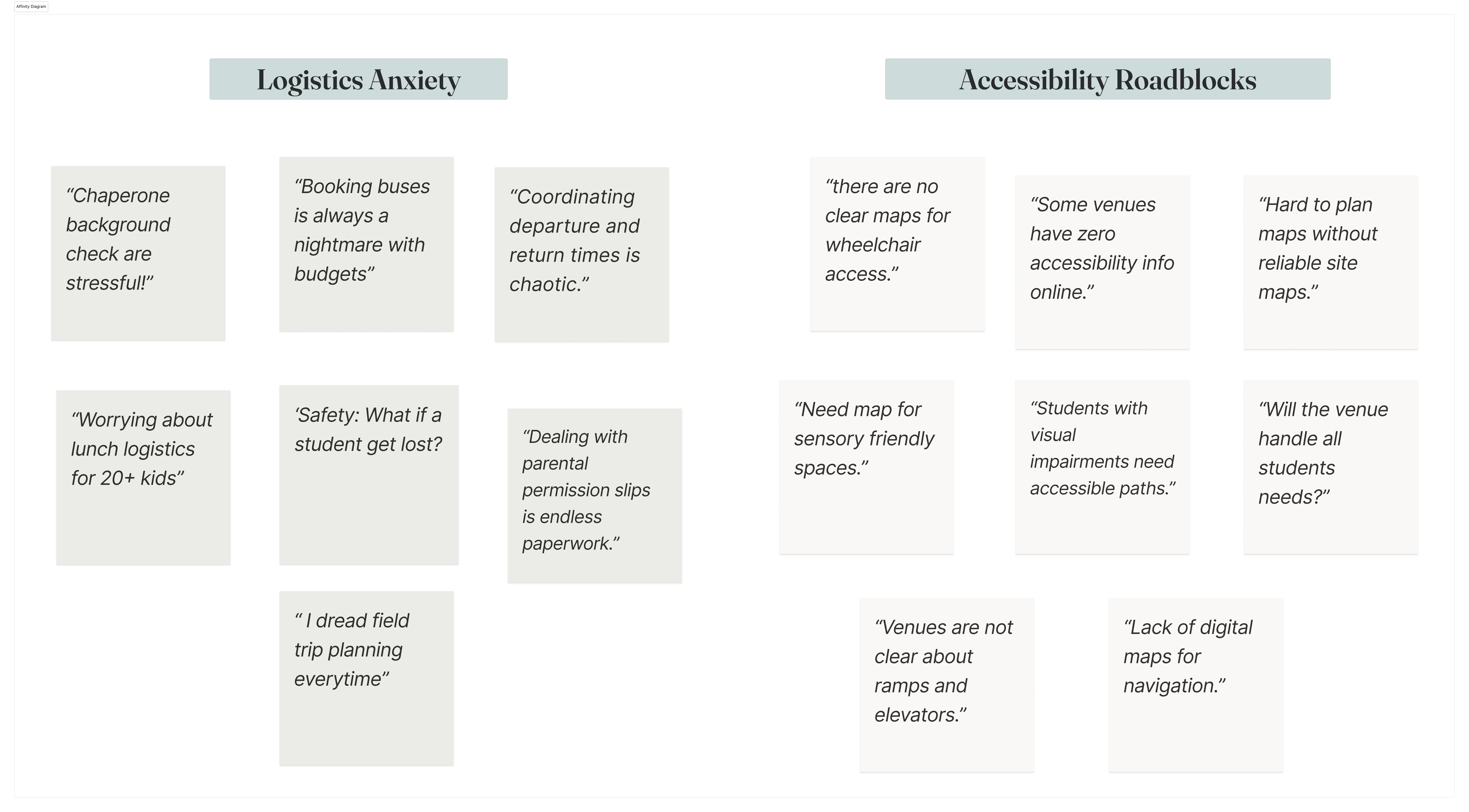
To translate this research into clear design goals, I grouped the interview transcripts and forum posts into themed clusters. Categorizing quotes under themes like Logistics Anxiety and Accessibility Roadblocks highlighted the core user needs that directly shaped the Tara persona.
The Problem
Teachers like Tara struggle to keep track of chaperone limits and student safety rules on field trips. Because they don't have a simple, unified tool to calculate supervision ratios or see clear accessibility routes, planning layout routes and group safety ends up being a stressful game of guesswork.
Competitive Analysis
To understand where existing tools fall short for educators like Tara, I audited two direct competitors — the Royal Ontario Museum (ROM) and the Art Gallery of Ontario (AGO) — alongside one indirect competitor, Tiqets, a mobile-first ticketing platform.
ROM and AGO offer strong institutional content and are trusted cultural authorities, but both rely on legacy booking flows that push group organizers into manual phone or email coordination, and treat accessibility as a static PDF rather than an interactive feature. Tiqets, by contrast, delivers a fast, mobile-optimized checkout experience — but it's built for individual travelers, with no support for group-specific needs like chaperone ratios or curriculum planning.
Key Differentiators
Manual Booking
Museum sites have authority but rely on slow, manual email booking.
Individual Focus
Ticketing apps are fast but designed for individuals, not school groups.
Static Accessibility
Accessibility info is hidden in static PDFs rather than being built into the trip plan.
Key Differentiators
- Museum sites have authority but rely on slow, manual email booking
- Ticketing apps are fast but designed for individuals, not school groups
- Accessibility info is hidden in static PDFs rather than being built into the trip plan
This study revealed two clear opportunities: first, no existing platform connects the museum's educational content with the actual logistics of running a group trip; second, accessibility information is currently buried in static PDFs rather than being built directly into the planning tools.
This shaped my goal: build a planning companion that pairs educational content with real-time, accessibility-focused logistics, making the planning process much faster and more reassuring for educators.
Meet the Users
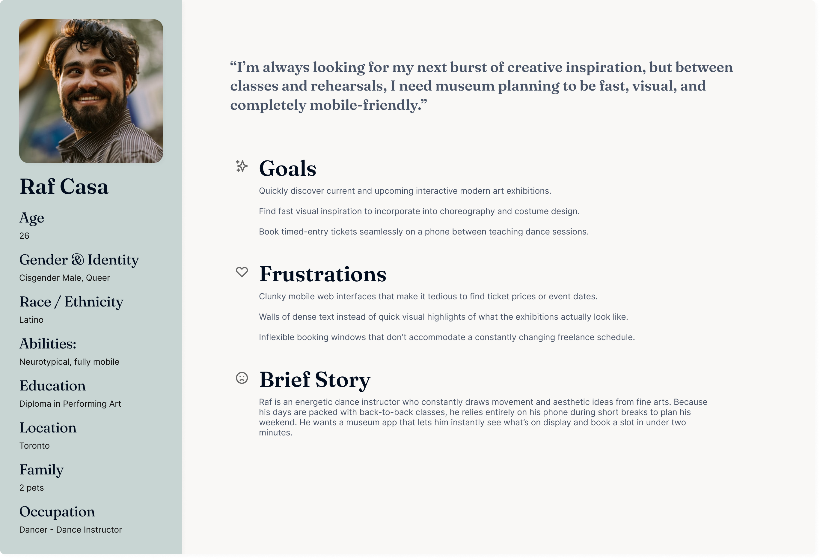
User Group Comparison
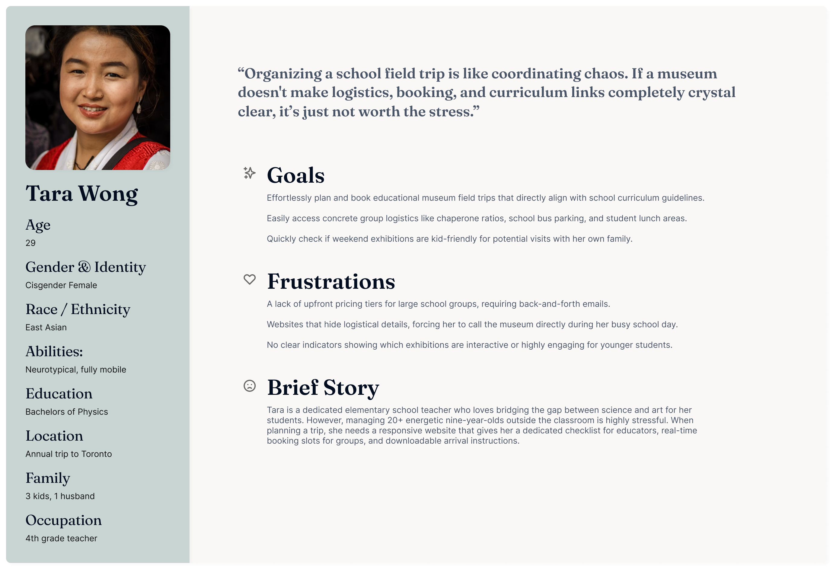
The Group Planner (Tara)
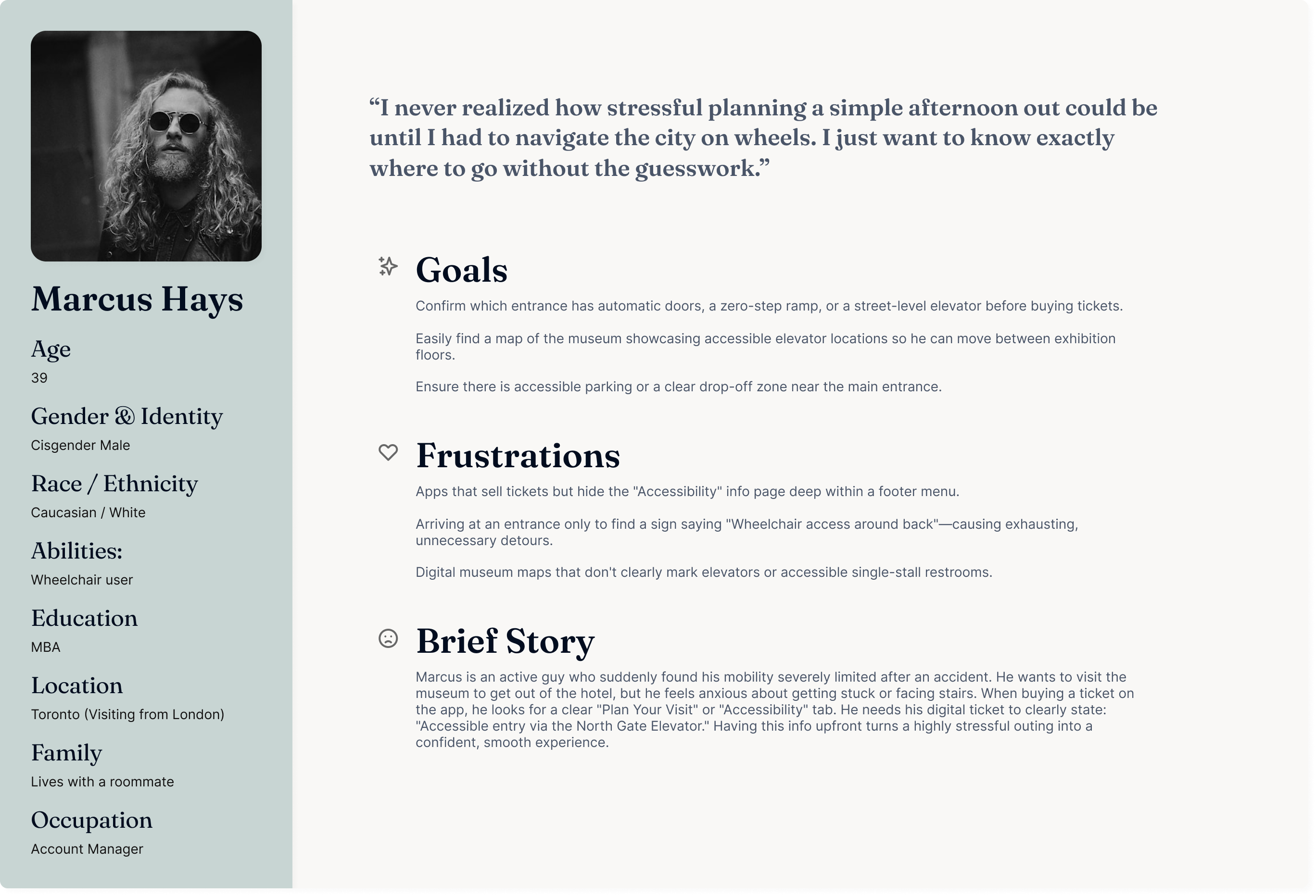
The Accessibility Visitor (Marcus)
The Local (Raf)
Task Analysis: Tara's Journey
I mapped out Tara's journey across five key stages to see exactly where she hits roadblocks and what features would help her the most.
1. Research
- Search for grade-appropriate exhibits.
- Check curriculum alignment.
Clear curriculum tagging system.
2. Initial Booking
- Try to find group prices.
- Navigate booking form.
Transparent, online tier-pricing.
3. Logistic Sync
- Inquire about bus parking.
- Check chaperone ratios.
Integrated logistical checklist.
4. Trip Day Arrival
- Coordinate 20+ students at the entrance.
- Check-in with museum staff.
- Navigate students to first activity.
Digital Group QR check-in & Wayfinding.
5. Post-Trip Reflection
- Reconcile school payment receipts.
- Share learning outcomes with parents.
Automated receipting & Resource packs.
Ideation
With the research insights in hand, I sketched out a few different directions before landing on the storyboard you'll see next.
Direction A: Standalone Ratio Calculator
A simple tool focused exclusively on solving the chaperone-to-student math.
Trade-off: Solved one problem but left accessibility planning as a separate, disconnected step.
Direction B: Chat-Based Planning Assistant
An interactive chat interface to guide teachers through booking steps.
Trade-off: Felt tedious for busy teachers who wanted to scan all details at a glance rather than chat.
Direction C: Unified Trip Dashboard
A single overview hub displaying trip status, ratio calculations, and accessibility options together.
Why Chosen: Combined ratio math and accessibility planning into one place, matching how teachers actually think about a trip: as one task, not three.
Storyboards
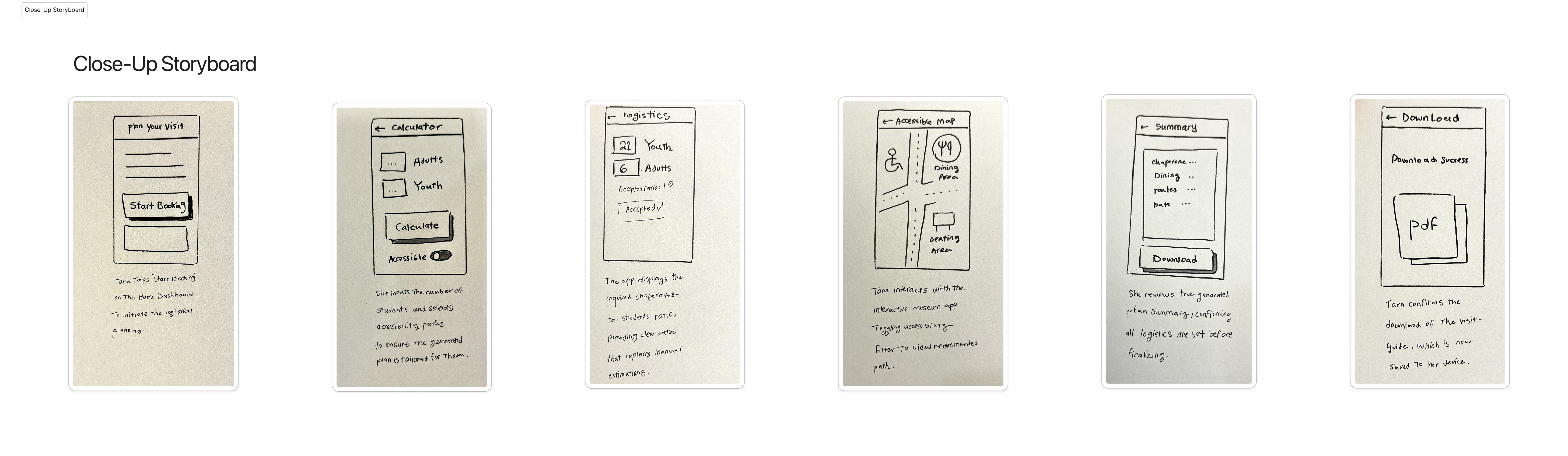
I sketched two narrative flows to visualize both the emotional context of the trip planning journey and the granular product mechanics.
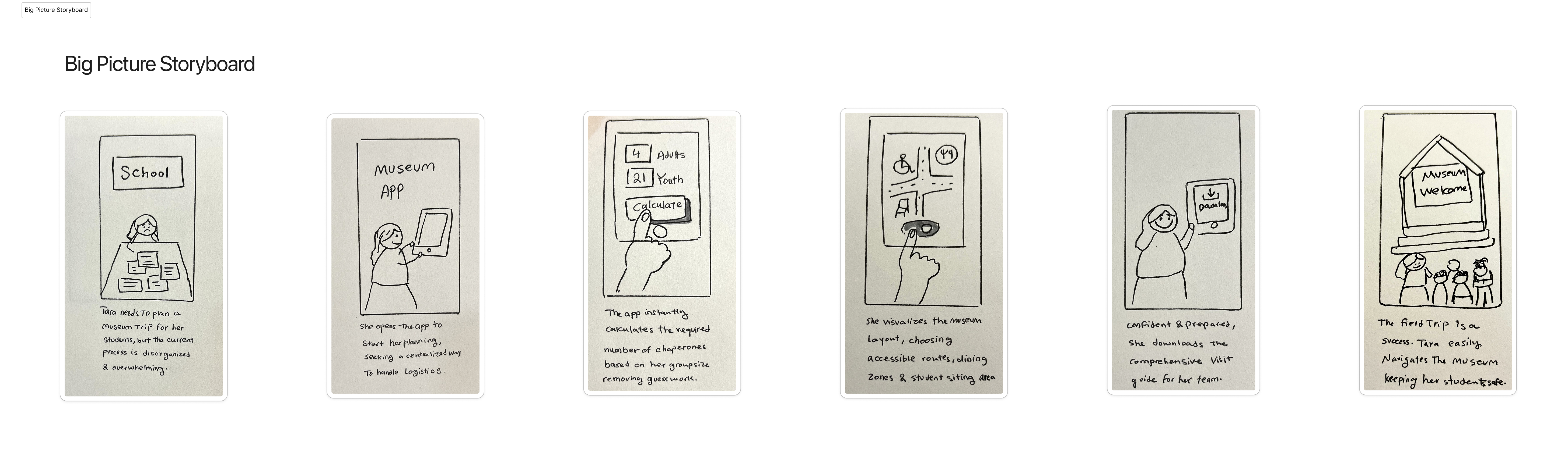
Big Picture Storyboard
Shows how Tara goes from manual, stressful coordination to arriving at the museum feeling confident and prepared. It visualizes how having a single trip guide helps her focus on teaching instead of paperwork.
Close-Up Storyboard
Maps out the exact screens and actions Tara takes in the app to plan and complete her trip, detailing the mechanical flow of the application.
User Flow
I mapped out this flow to see how teachers would navigate from the initial dashboard, through the chaperone calculator, to the final visit guide and floor plan.
Booking-to-Departure User Flow
Core task flow diagram mapping the dashboard, logistics calculator, summary, and interactive floor plan pages.

Prototyping & Blueprints
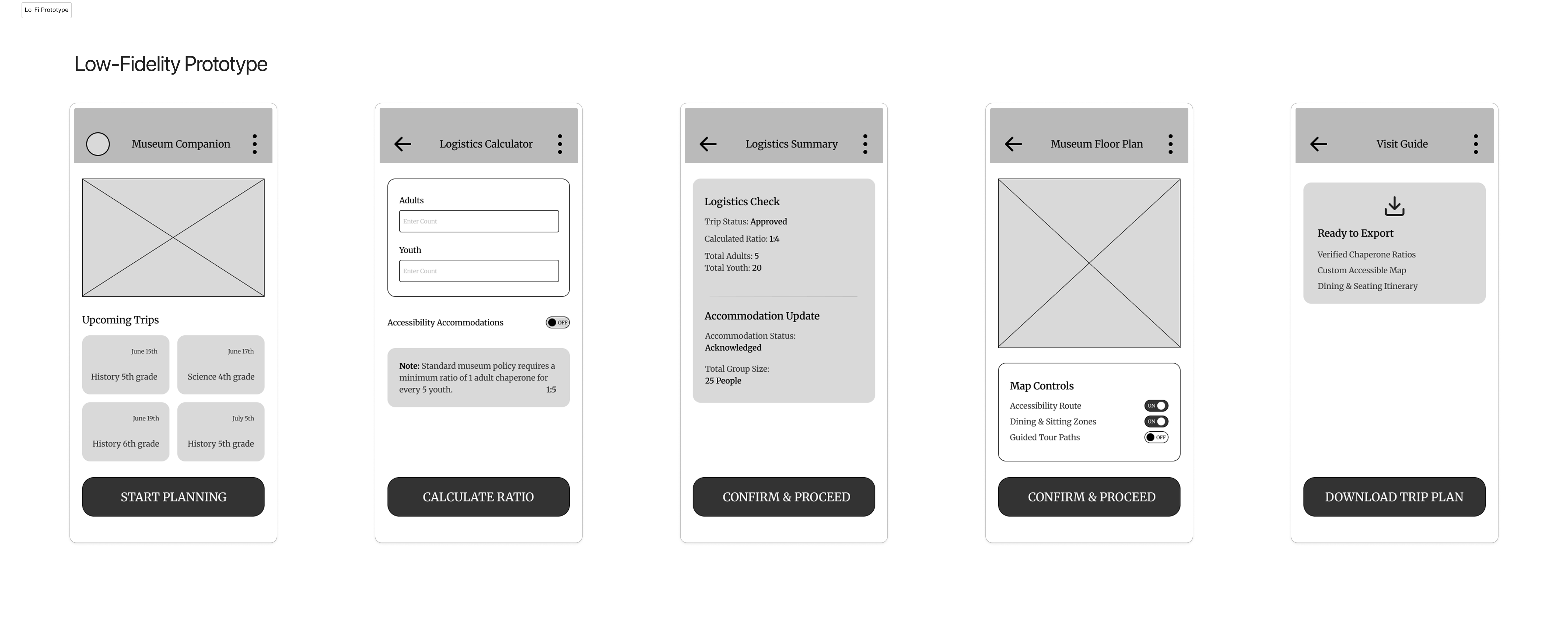
I built wireframes and blueprint iterations to test the interactive mechanics of the application before moving to visual design.
Lo-Fi Prototype
Tests how the app handles accessibility. If a teacher notes that a student has accessibility needs during the setup, the app automatically flags elevator locations, ramp routes, and accessible seating directly on their custom floor plan.
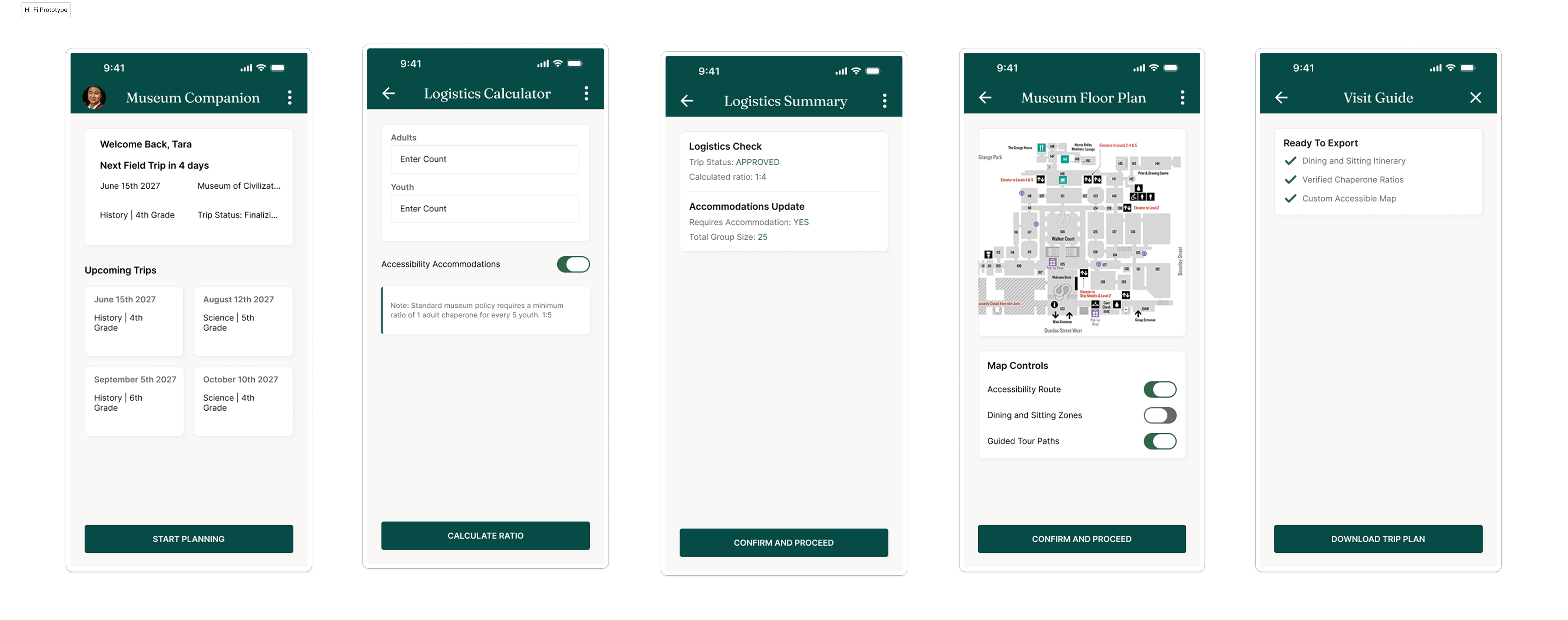
Iteration 0: The Functional MVP Blueprint
I started by mapping out the simplest path for teachers to run their logistics and generate their custom floor plans.
Refining the Dashboard
Once I had a working MVP, I realized I'd designed for a "perfect" screen — not for what real data actually looks like. Testing with longer trip names and more entries broke the layout in a few places, so I went through several rounds of fixes:
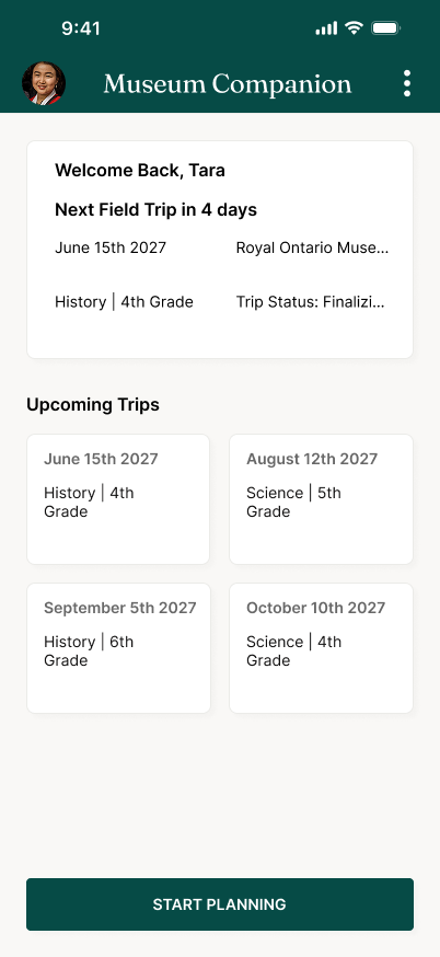
Text was getting cut off with longer trip names
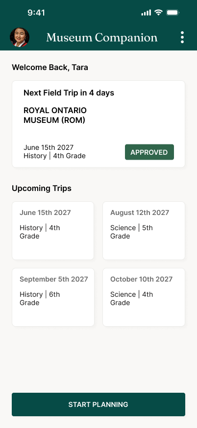
Let text wrap instead of clipping
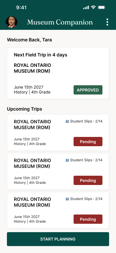
Switched to a clearer linear timeline layout
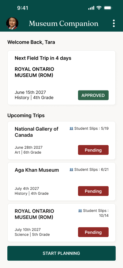
Filtered out duplicate/irrelevant data so the dashboard only shows what's actionable
Usability Testing
I tested the prototype against a real scenario: log in, check an upcoming trip's approval status, calculate the chaperone ratio for 25 students, and export an accessible route map.
Educators could find what they needed, fast
During testing, all participants successfully identified the status of their upcoming trip within 2.5 seconds of landing on the dashboard. In my first layout, historical and upcoming field trips were clumped together, causing teachers to click past events by mistake. I fixed this by building an automated sorting filter that pins the current week's trip to the very top of the screen, which dropped user identification time down to a fraction of a second.
Teachers wanted a faster way to act on the data
Educators pointed out that keeping track of returned student slips was the most critical daily task. During testing, they requested a way to act on this data directly from the card state. Based on this, I added a "Send Reminder Ping" micro-action toggle directly inside the pending trip card to help teachers follow up with parents and close the administrative loop faster.
Pre-filled defaults prevented calculation errors
By building standard school board ratios directly into the form inputs as automatic defaults, the "Dynamic Defaults" system reduced ratio calculation errors to zero. School boards enforce strict legal chaperone-to-student ratios, but teachers often waste time hunting through PDF handbooks to find the rules. Pre-filling these guidelines automatically when a user enters their student count prevents ratio compliance rejections entirely before final submission.
At this stage, I moved from wireframes to high-fidelity layouts, testing key mobile interactions like thumb-friendly bottom menus and clear header sizing. I also made sure the ratio inputs flag validation errors immediately so teachers can't submit an incomplete plan, and built accessible path toggles directly into the map screen.
Design System
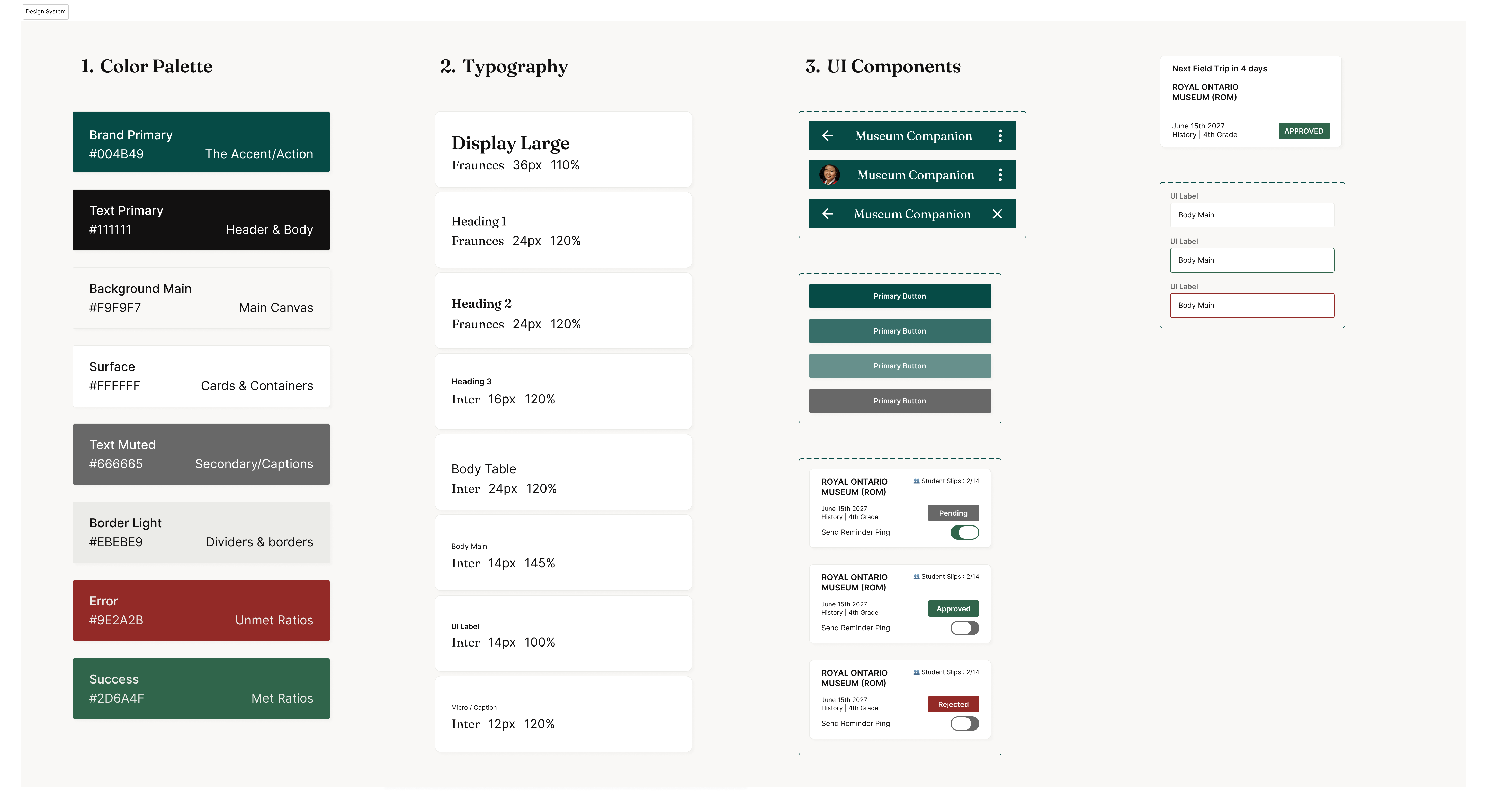
I built a simple design system for the app to keep the interface consistent across all pages.
Matcha Green UI Style Sheet
A style guide built around a calm, natural matcha green and dark charcoal to meet strict contrast standards, including standard typography sizes, buttons, form inputs, and reusable card containers.
Inclusive Design & Accessibility
To make sure the app works for every teacher, I focused on accessibility at every step:
Interactive Accommodation
I built wheelchair-accessible route toggles directly into the map screen and added accommodations tracking to the logistics form. This makes accessibility a core part of the setup rather than an afterthought.
High-Contrast Aesthetics
I used a clean, high-contrast palette (dark green on off-white) to meet text contrast standards, and kept the layout card-based so teachers can easily scan details on the move without feeling overwhelmed.
Takeaways & Next Steps
Working on Museum Companion pushed me to think about accessibility as a default, not an add-on — building the "Dynamic Defaults" system meant accessibility needs had to be part of the data model from day one, not bolted on after.
I was surprised by how much teachers appreciated moving the chaperone policy math directly into the form inputs. If I could start over, I’d tell myself to focus earlier on these small administrative frictions—they make a much bigger difference to a teacher's peace of mind than any visual detail.
Next Steps
Broad Usability Validation
Test the dashboard with a larger group of educators (10+) to see if the chaperone-ratio flow holds up across different school sizes.
Co-chaperone Interface
Explore a lightweight version for co-chaperones/parent volunteers, who currently have no view into the plan at all.
Reducing Admin Overhead
Validate with museum-side ticketing staff whether pre-validated submissions (via Dynamic Defaults) actually reduce their manual review and revision cycles.
Next Steps
- Broad Usability Validation: Test the dashboard with a larger group of educators (10+) to see if the chaperone-ratio flow holds up across different school sizes.
- Co-chaperone Interface: Explore a lightweight version for co-chaperones/parent volunteers, who currently have no view into the plan at all.
- Reducing Admin Overhead: Validate with museum-side ticketing staff whether pre-validated submissions (via Dynamic Defaults) actually reduce their manual review and revision cycles — a hypothesized downstream benefit that hasn't yet been tested with that user group.