Prompt Lab Compare View
An enterprise proposal to enable side-by-side prompt and model iterations, built entirely within the constraints of the IBM Carbon Design System.
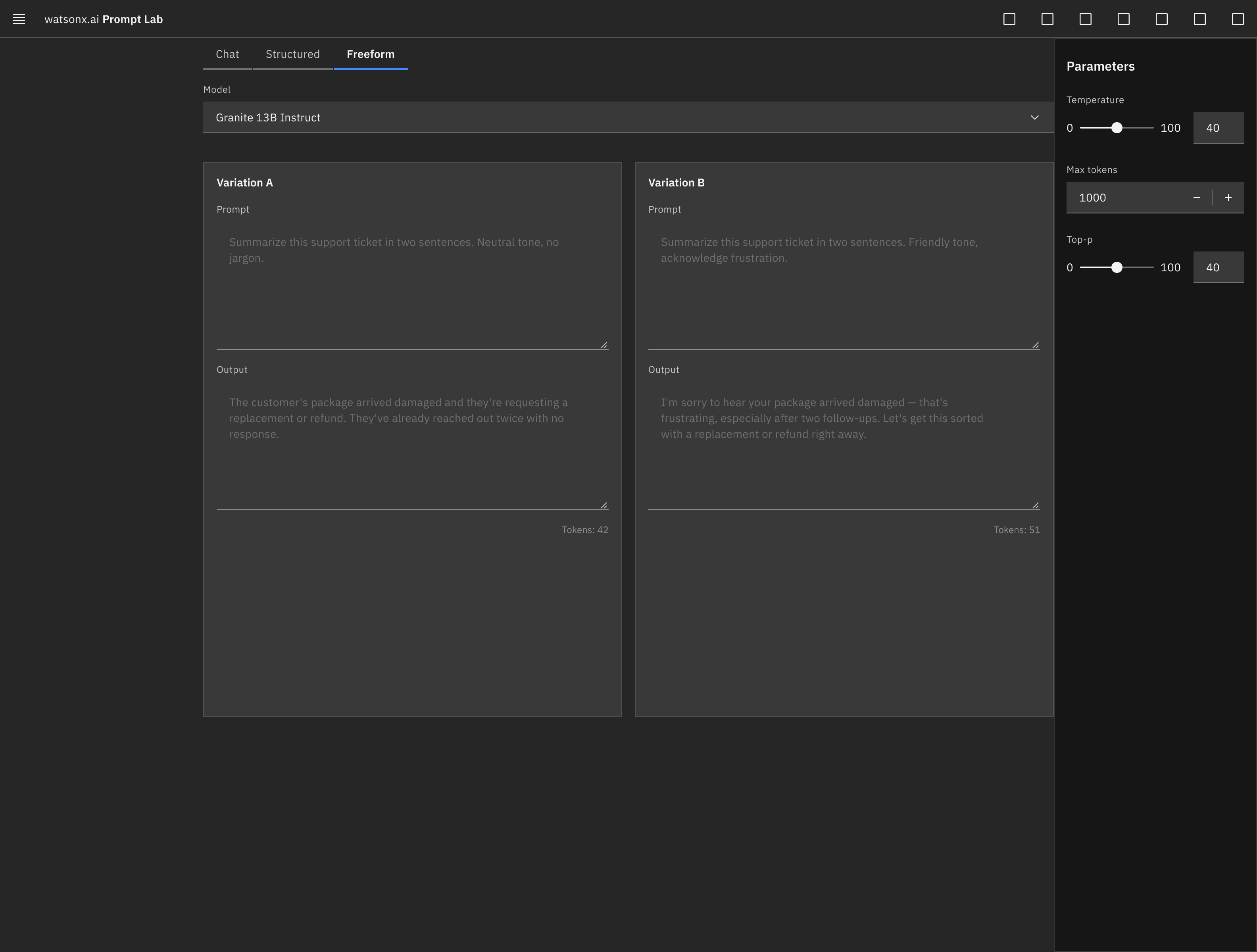
Parameters side panel (temperature, max tokens, top-p) and per-pane output metrics visible above, right and bottom of each comparison pane.
Concept Overview
IBM watsonx's Prompt Lab is where teams experiment with generative AI models — writing prompts, adjusting parameters, and reviewing outputs before using a model in production. This is a concept proposal for one new screen: a side-by-side Compare view, letting a user test two or three prompt or model variations at once instead of one at a time. The entire screen is built using only components from IBM's Carbon Design System — that constraint is the point of the exercise, not a footnote. This is a self-directed design proposal, not an IBM-commissioned project.
The Problem
Prompt Lab's editor supports one prompt, one model, one pane at a time. Comparing two approaches — a different phrasing, a different model, a different temperature — means running one variation, noting the result, then overwriting it to run the next. There's no persistent side-by-side state, so the tool's most common real use case, iterative experimentation, isn't directly supported by its own interface. This is a reasoned observation from using the live product, not a data-backed finding.
Proposed Solution
We propose a tabbed comparing framework that splits the single workspace canvas into a responsive grid. This allows users to execute concurrent prompts and compare outcomes side-by-side.
Compare Toggle
Switches the single editor into 2-3 side-by-side panes, laid out on Carbon's Grid.
Per-Pane Structure
Each pane holds its own prompt editor, a filterable model Dropdown, and a collapsible parameter Side Panel.
Run All
A single Button fires every pane together, so comparisons run under the same conditions.
Output Row
Each pane's response and token count sit directly below its prompt, visible without extra clicks, structured as a Data Table.
Select & Continue
Pick the winning variation and drop back into single-editor mode with it already loaded.
Every element — Grid, Tabs, Data Table, Side Panel, Dropdown, Button — is an unmodified Carbon component instance. This is what "extending components in Figma" looks like in practice: composing within an existing system's rules rather than inventing new ones.
System Alignment & Value
Proposing new interfaces within enterprise environments requires careful alignment with existing component libraries rather than creating custom visual patterns. This concept is built using standard Carbon components:
Carbon Layout System
Manages responsive 2-column or 3-column layouts across desktop screen sizes.
Workspace Pivots
Switches viewports from single editor workspaces to structured comparison panels.
Metric Comparisons
Formats inline output comparisons, execution latency, and token consumption metrics.
Parameter Overrides
Slides open to configure temperature, stop sequences, and top-p limits on a per-pane basis.
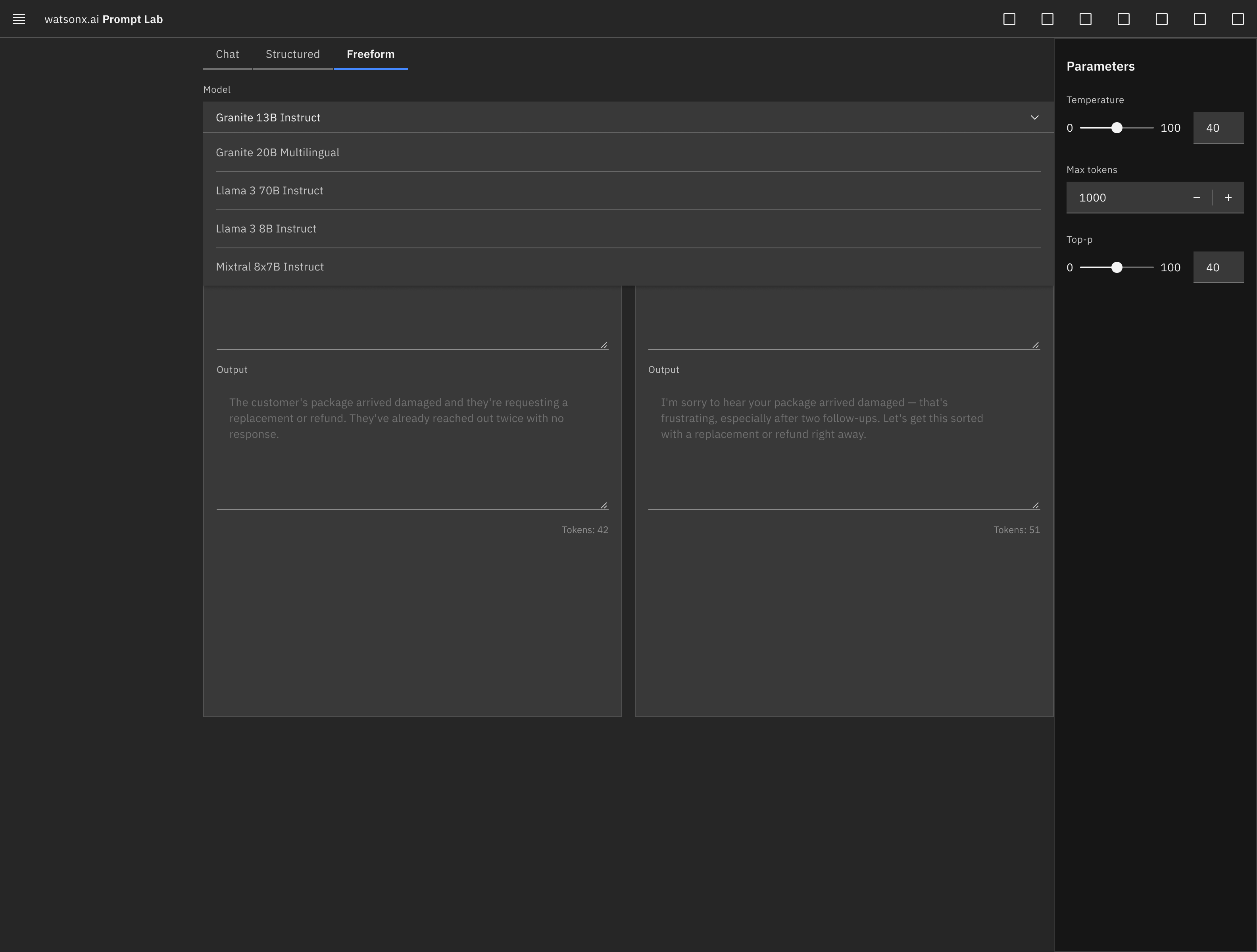
Dropdown → Model Picker with Filterable List
The Dropdown component acts as the model picker inside each prompt editor pane, enabling users to choose and search through filterable lists of foundation models.
Why This Matters for Constrained-System Work
Working inside someone else's design system, without breaking its rules, is a different skill from freeform design — and it's the skill that shows up directly in multi-surface consistency (a website, app, and kiosk that all need to stay coherent), in fintech-style data-dense interfaces, and in enterprise design systems generally. This project is a deliberate demonstration of that skill, aimed squarely at the kind of work Indigo's multi-channel stack and fintech product teams actually do day to day.